
The premise
Searching for an apartment is boring, and we wanted to make it better. Instead of typing in a location and seeing results, we wanted to guide to your next home. This was the premise of our new iOS app, Apartment List: Denver. You tell us what you need in your new home, and we’ll match you with places you might have never considered.
Denver was perfect for this concept. We had extremely high quality data on Denver apartments, it’s one of the fastest growing cities in the country, and it’s full of tech savvy iPhone users.
Guided Search
In the beginning our goal was to provide what we called “guided search”. We didn’t exactly know what that meant, but we knew that we could provide users with more insight into how and where to look for an apartment. One of my early suggestions was to insert questions in between listings once the user ran a search. “Do you have pets?” if you answered yes, we’d update your filters and rerun a pet friendly search.

While this might be convenient, it is also easily ignored when you have apartment listings right in front of you and all you want to do is start looking through them.
We began working on wireframes based on the guided search concept. Instead of asking questions after a search had been run, we’d ask you about your preferences before you see any listings. Screen by screen, users would be asked about price, size, pets, amenities, and finally a screen we called “personality”, and we’d sort the listings based on their replies.

If you said budget was most important to you, we’d show you the cheapest listings first. Can’t live without that dishwasher, pool, patio, and a dog park? We’ll start things off by showing you apartments that match every single amenity you care about.
Concierge concept
One of Apartment List’s many strengths is their team of “Renter Experts”. Call in and you’ll be immediately connected to a Renter Expert who can create a list of apartments that match your specifications. They’ll do the searching for you, and you’ll enjoy the conversation with them. It’s a great service and I wanted to make sure we took full advantage of it. I had an idea to match renters with renter experts directly in the app. Once you had been matched with an expert, you could see their photo, send them a message, or give them a call. They’d have access to your preferences in the the app and could immediately start suggesting apartments that match your needs. You’d have a real human dedicated to your apartment search anytime you needed them, all for free.
Working with our iOS product manager, I mocked up designs for this concept. We ran our designs through moderated user tests on usertesting.com. What we learned was surprising. Users were confused about the concept — they didn’t understand the need for an assigned expert. In most cases they didn’t believe that the renter expert was actually “theirs”. They valued the idea of an expert’s opinion on trendy neighborhoods and dog friendly housing and parks, but when it came to having a human on the other end of the app it just didn’t click.

Armed with user feedback, we decided that the option to contact our renter experts was still a highly valuable feature, but it did not need to be the focus of the app. Because of this we kept the feature to message or call our experts at any time.
Matches
We wanted to show the user apartments in a careful and intentional way. A list of results wouldn’t work — they might judge the apartment on a thumbnail photo or some other minor detail, disregarding what might be a great match for them before even taking a look into the details. It was decided that we’d show them apartments one at a time. This would allow the renter the time to consider each option.
With this model in mind, our next step was to decide on how we should group these apartments and present them to the renters. One idea that really stuck was how the Netflix recommendation algorithm was key to discoverability and a great user experience with their product — e.g. “Because you watched Star Wars, we think you’ll like these science fiction movies”. We could use this same concept, but group the apartments based on the questions we had asked the renter in the quiz. We decided to group apartments based on price, size, location, amenities, and also some suggestions a bit outside of their preferences. It was a radical idea internally because we were inserting apartments outside their search criteria. Once again we tested this concept on User Testing, and it was very well received.

Based on our user feedback, I designed the flow around showing apartments one at a time, which would be called matches. The challenge was to come up with a way of presenting an apartment at a glance using the preferences collected during the quiz as a guide. With this data we could show the user how well the apartment matched up with what they were looking for.

Interaction
Up next was the interaction on this screen — how would they navigate to the next apartment? Swipe like Tinder? If they said they liked a place, how would they revisit those selections? What would happen if they said they didn’t like it? One idea I had was to have the user drag the apartment into a tab on the nav bar. This way they would know where to find the apartments they like. It will knock out two birds with one stone — provide context for navigating through the app, while keeping the bulk of their screen experience focused on the next apartment in the group. I partnered up with one of our iOS engineers and made a prototype using proto.io.
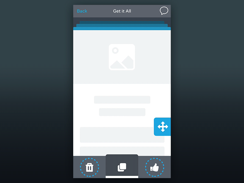
After playing with it a bit and testing it with our team, I came to the conclusion that even though it was fun, it was an unnecessary interaction that the user had to learn. We didn’t want them to have to think about how to use our app, and we also didn’t want to dedicate 1/3 of the nav bar to the apartments they said no to. This was supposed to be a way to find places you like, not places you don’t. What I came up with instead were action buttons in a bar at the bottom of the screen which said “Not For Me” and “Could Work”. If you said not for me, we’d get that apartment out of your way so you can move on to one that is. Said could work? Great, we’ll add that apartment to your short list to view later.

Once you navigated through a group of apartments and reached the end, we’d confirm that you’d made it through the group with a fun message like “As the kids say, BOOM”. We’d then encourage you to move on to the next group of apartments. This pattern gave the user some motivation to finish each group.
Short list
After saying ‘Could Work’ to a number of apartments, the user will need to have a place to return to see their favorites. This became the ‘Short List’. In the short list you can keep track of all of the apartments you said ‘Could Work’ to, and even favorite any within the list that might be a top choice.
We wanted to be sure to allow the user to identify which apartments they’re very interested in without losing those that might not be a top choice at the time. In the beginning we had all sorts of fun features planned for this screen, but ultimately decided the most important function was simply giving the renter a place to view their favorites.

The final challenge we faced was deciding when to inform the property that the user was interested. We needed to be careful not to send off the user’s contact information to property management unless the user was highly interested in the listing. Our solution: the Top Choice action, which covered both the list refinement requirement and the renter prospect quality requirement. It would move the apartment to the top of the user’s ‘Could Work’ list, as well as inform the property that they were interested in it.
Conclusion
The app turned out to be a great success. Shortly after launching, Apartment List expanded the app to include many more cities. It was truly different than the competition, and a fun new way to find your next apartment.